Minimal Mind Brand Identity
01.10.24·Jordan Prescott
The Brief
There was no client brief. There was a studio that needed to stand for something — and the identity had to reflect that before a single piece of work left the door.
Minimal Mind needed a brand that lived its own philosophy. Not a brand that talked about minimalism while being visually loud. Not a brand that claimed craft while cutting corners on its own identity. The brief, self-imposed, was simple: build something that is exactly what it says it is.
The Problem
The hardest brief is the one with no constraints except the ones you set yourself.
Fifteen logo iterations in, the problem became obvious: the pursuit of clever was the enemy of minimal. Each iteration tried to be interesting — pixelated letterforms, stacked squares, abstract M-shapes, geometric marks that referenced AI and architecture simultaneously. All of them were trying too hard. None of them were what Minimal Mind actually was.
The real problem wasn't finding the right visual. It was letting go of the instinct to impress, and trusting that restraint is a statement.
The Approach
The breakthrough came from going back to first principles. Three ideas had always sat at the core of Minimal Mind: compounding — the idea that small, deliberate efforts stack into something significant over time. The black box — a term from AI meaning a system whose inner workings are opaque, whose output is the point. And pixels — the irreducible unit of everything visual, a square at its smallest.
A square contains all three. A block you can stack. A black box you can invert. A pixel rendered at scale. It required no embellishment, no clever construction, no explanation. It simply was.
The wordmark followed the same logic. Numerous approaches tried to introduce personality through typography — pixel-distorted letterforms, custom modifications, references to digital culture. All of them were abandoned. The right answer was Geist: clean, sans-serif, letter-spacing tightened until it felt intentional. The square and the wordmark placed side by side. That was it.
Two variants followed naturally — a compressed mark using just the square and
MM, and a sub-brand treatment that replaces Minimal Mind with Studio or Labs depending on context. None of them required design. They required discipline.The Work
The Logo
A black square. Invertible to white. Placed slightly off-centre wherever it appears — a deliberate human imperfection that signals the work is made, not generated. The logo is not trying to communicate anything except presence. The work does the communicating.
Surface + Shell
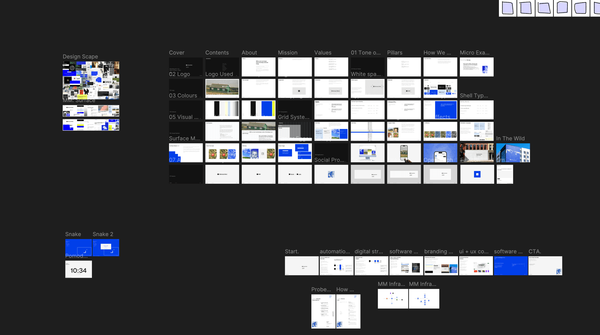
The design system is built around a philosophical split that reflects MM's dual identity as both studio and engineering practice.
Surface is the visible layer — the gallery. Beautiful typography, warm photography, considered colour, generous whitespace. This is where design lives. It feels like an art book.
Shell is the underlying system — the terminal. Hard blue, monospace typography (PPNeueBit), the visual language of computer systems. This is where technology lives. It feels like a codebase.
Neither exists in isolation. The system is designed to glitch between them — hover over a Surface photograph and it pixelates into Shell territory. A moment of bleed between worlds. Engineer meets artist. The seam is intentional.
Colour
Four colours, each named rather than coded:
- Glow — a warm pearlish yellow. Sunlight on skin. Unhurried.
- Rain — a pastel blue-grey. The colour of a sky mid-shower. Calm.
- Off-black — not pure. Has warmth in it.
- Off-white — not stark. Has texture.
Typography
Two typefaces, one per world.
Geist lives in Surface — clean, modern, precise. Every weight and size has a purpose.
PPNeueBit lives in Shell — pixel-rendered, monospace, unapologetically digital.
Photography
Four presets, each with a name and a feeling:
- Lived In — warm, grainy, slightly soft. A memory, not a portfolio shot.
- MM Signature — cooler, more blue, more considered. The house style.
- Disposable — behind the scenes. Captured in the moment.
- Mono — grain-heavy black and white. Pre-digital in spirit.
Easter Eggs
A snake game lives somewhere in the site. Glitch effects fire unexpectedly. The playfulness is part of the identity. It just doesn't announce itself.
The Outcome
A brand that is exactly what it says it is. Minimal. Purposeful. Quietly confident. Built to let the work speak, not to perform in front of it.
Stack & Tools
- Figma — design system and brand documentation
- Geist — primary typeface (Surface)
- PPNeueBit — pixel typeface (Shell)
- Procreate — illustration and photography exploration
- Lightroom — photography preset development